
Case study / Travel platform
Bringing every post-booking decision into one calm journey.
Overview
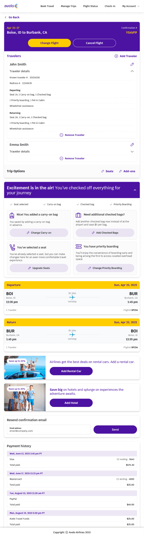
A redesign of the manage-trip experience that brings itinerary, travelers, add-ons, changes, and payment context into one coherent view across web and mobile.
Core contribution
- Post-booking journey and task architecture
- Traveler, itinerary, and add-on management flows
- Responsive interaction and content hierarchy
- Edge-case definition and delivery collaboration
The challenge
After booking, a trip becomes a collection of decisions.
Travelers return to manage a booking with a specific job in mind: confirm a detail, change a flight, update a traveler, or add something they missed. Those tasks carry urgency and often span separate systems. The design challenge was to reduce that fragmentation without hiding the operational detail people need to feel in control.
Experience model
Organize the page around the journey, not the transaction.
I structured the experience as a persistent trip record. Reservation status, travelers, options, flight segments, and payment history sit in a deliberate sequence, allowing people to scan the whole journey while still moving directly into a task. Primary changes remain visible; secondary detail uses progressive disclosure to keep the page calm.
Interaction design
Make consequential actions clear before they become stressful.
Change and cancellation actions are separated from everyday trip management, while edit controls stay close to the information they affect. Status messaging, completed-item feedback, and contextual add-ons help travelers understand what is already included, what can still change, and what happens next.
Responsive continuity
Preserve the same mental model across devices.
The responsive system keeps the order and language of the trip consistent while adapting density for smaller screens. Expandable traveler details, stacked itinerary cards, and full-width actions protect readability without creating a separate mobile logic that users would need to relearn.
Outcome